Component Presentation Schema
|
Status: Under active development. Availability: Behind the StackPacks 2.0 feature flag. Refer to Custom Integrations Overview on how to enable the feature. This documentation describes the current design intent and high-level configuration surface. Note: no behavior and capabilities have been implemented yet. As this feature is under active development; behavior, schemas, and capabilities may change as the model evolves. |
Overview
This page documents the configuration schema used by the UI Presentation model. It is intended as a reference for authors defining UI presentation behavior.
All schemas described here are part of StackPacks 2.0 and are under active development.
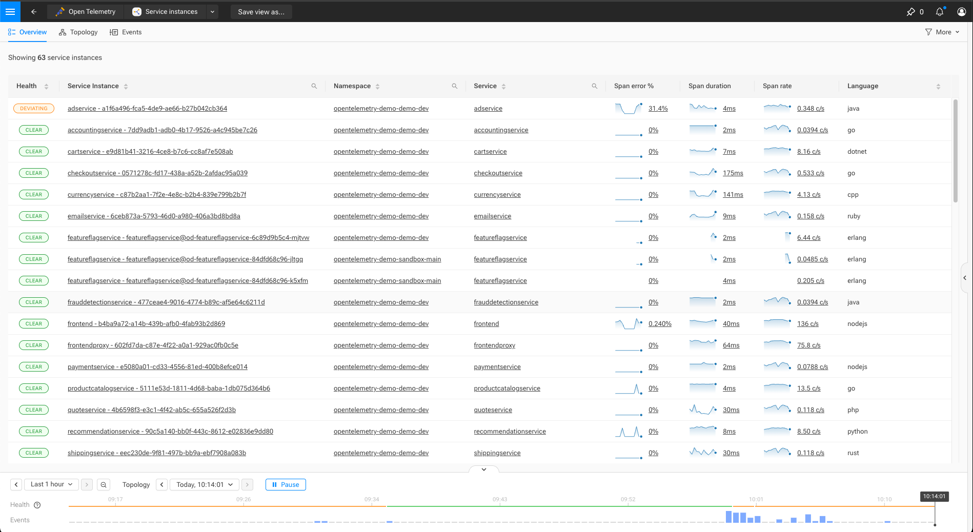
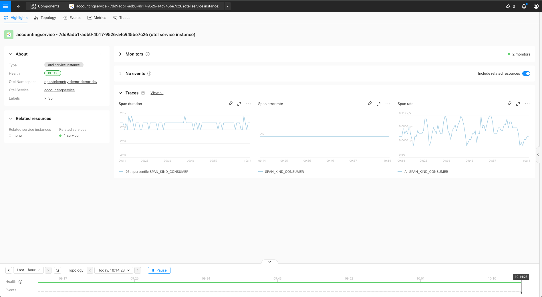
UI pages populated by ComponentPresentation
See the following screenshots to get an idea of which pages and UI elements on the respective pages the ComponentPresentation configuration pertains to.
ComponentPresentation
A ComponentPresentation defines how matching components are presented in the UI
for a given mode and context.
_type: ComponentPresentation
identifier: urn:...:component-presentation:<presentation-name>
mode: ["observability" | "security" | "all"]

binding:
  _type: ComponentPresentationQueryBinding
  query: string                       # Primitive STQL query used to match components

rank:
  specificity: number                 # Higher values indicate more specific definitions

presentation:
  icon: string                        # Optional icon (base64-encoded)
  name:                               # Optional naming configuration
    plural: string
    singular: string
    title: string

  mainMenu:                           # Optional main menu entry
    group: string                     # Name of an existing MainMenuGroup
    rank: number                      # Optional override within the group

  overview:                           # Optional overview page configuration
    columns:
      - _type: string                 # ViewTypeTableCol*

  highlight:                          # Optional highlight page configuration
    summary:
      ...
    fields:
      - _type: string                 # ComponentTypeField
        fieldId: string
        label:
          title: string
          helpBubbleText: string      # Optional
        valueExtractor:
          _type: string
        display:
          _type: string
    about:
      _type: ComponentTypeAbout
      fields:
        - string

  filter:                             # Optional overview filters
    - _type: FilterField
      name: string
      tagField: string
Identifier
Identifiers should follow the SUSE® Observability identifier (i.e., urn:…) format. Refer to identifiers documentation for more information.
Binding
The binding determines which components a ComponentPresentation applies to.
Bindings are evaluated against component data and must be simple and efficient, as they are used during UI evaluation.
Currently supported binding type:
-
ComponentPresentationQueryBinding: an STQL query (refer to the STQL for more information)
Rank
The rank section controls how multiple matching ComponentPresentation definitions are combined.
Higher specificity values indicate more specialized definitions and take precedence over lower values when composing presentation behavior.
Presentation sections
All fields under presentation are optional. A ComponentPresentation may define only a subset of presentation aspects.
Presentation sections are composed when multiple definitions apply to the same component.
Main menu
Controls whether matching components appear in the main menu.
The referenced menu group must be defined separately using MainMenuGroup.
Overview
Defines columns shown in overview tables.
Columns may override or extend columns defined by other matching presentations.